What the White Space Said: How Comics Learned to Speak in Silence
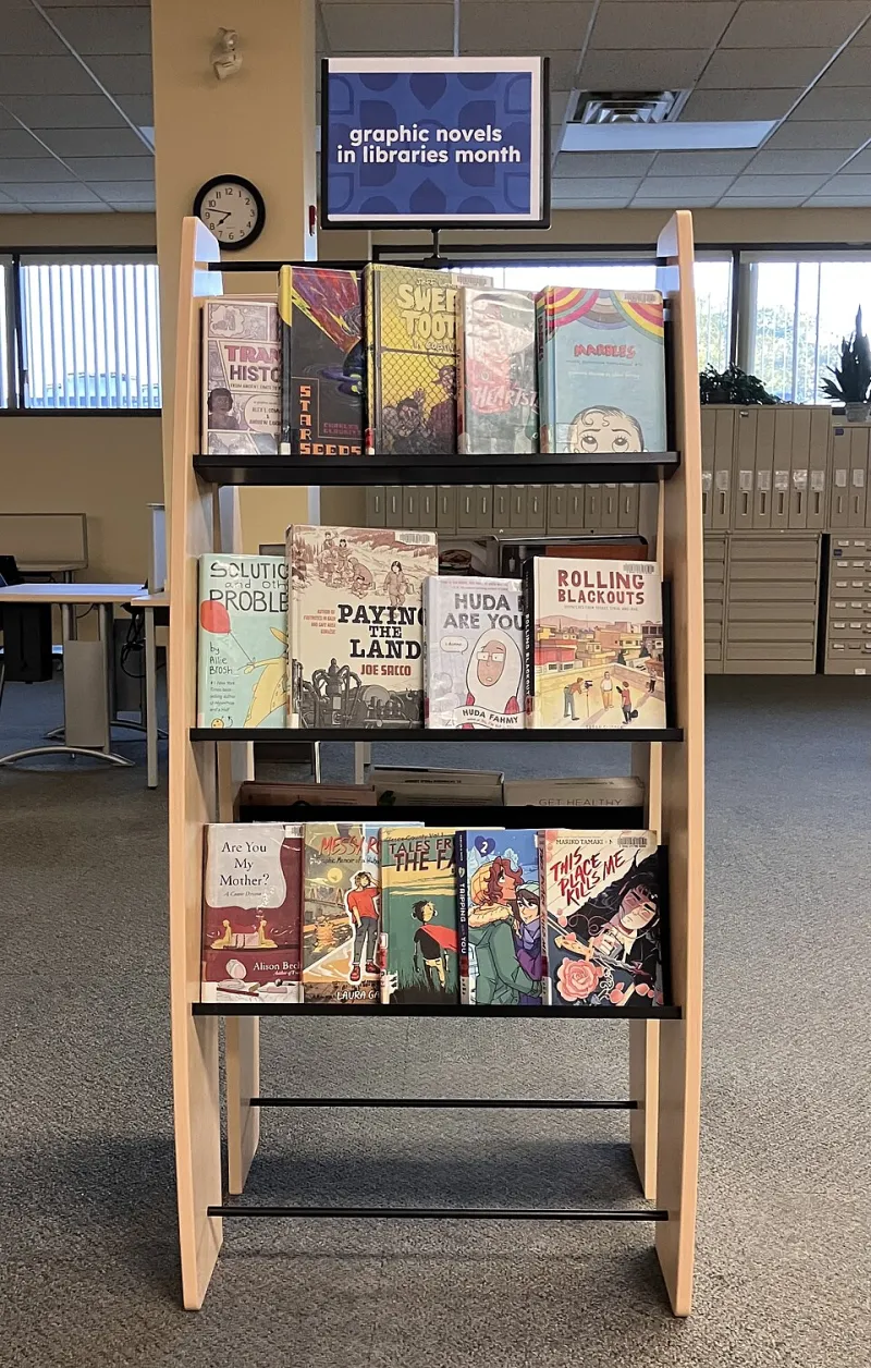
Photo: Gogerr, CC BY-SA 4.0, via Wikimedia Commons
There's a panel in Alison Bechdel's Fun Home where she draws herself as a child, standing in a doorway, watching her father from behind. He doesn't know she's there. Neither panel before nor after it explains what she's feeling. And yet you feel it — that specific, suffocating mix of love and distance and not-quite-knowing. No caption. No dialogue balloon. Just a girl in a doorway.
That moment doesn't work in prose. Not the same way. You could describe it in three paragraphs and still land lighter than that single image does.
This is what graphic novels have quietly figured out over the last few decades: the medium's supposed limitation — the fact that you're working in frozen images rather than flowing language — is actually its sharpest tool. The constraint is the power.
The Gutter as Emotional Engine
In comics theory, the space between panels is called the gutter. It's the white gap, the pause, the breath the reader takes while their brain completes the action that the artist deliberately left undrawn. Scott McCloud mapped this out in Understanding Comics back in 1993, calling the phenomenon "closure" — the way our minds instinctively fill in what's missing.
What's happened since then is that a generation of artists took that concept and ran somewhere much darker and more interesting with it. They started using the gutter not just to imply physical movement — a fist raised in one panel, a character on the floor in the next — but to carry the full weight of psychological experience.
Take Chris Ware's Building Stories, a graphic novel that arrives in a box of loose pamphlets and boards, each piece a fragment of a woman's inner life. Ware's gutters aren't just transitions. They're time. They're the years that passed while nothing changed. The white space between his panels sometimes represents a decade of quiet disappointment, and you feel every year of it without a single word of explanation.
That's not illustration. That's architecture.
Composition as Confession
Panel composition — where figures are placed, how much of the frame they occupy, what gets cropped out — has become one of the most emotionally precise languages in contemporary storytelling.
Jeff Lemire does something almost cruel with this in Essex County. His figures are small. Frequently tiny. Set against enormous Canadian skies and flat, indifferent farmland. The visual choice communicates something no amount of interior monologue could fully replicate: these people are dwarfed by their own grief. The landscape doesn't care about them. And somehow, that visual fact makes you care about them more.
Marianne Satrapi takes the opposite approach in Persepolis. Her figures are bold, flat, almost confrontational in their graphic simplicity. The compositions feel like woodcuts — stark, declarative. And that visual confidence actually amplifies the vulnerability of what she's describing. When a character drawn with that much visual certainty falls apart, it hits harder because the style itself seems like it shouldn't allow for collapse.
Both artists are making the same discovery from different directions: how you frame something is what you're saying about it.
The Page Turn as Punctuation
One thing prose genuinely cannot replicate is the page turn. Comics artists have learned to weaponize it.
In Maus, Art Spiegelman places certain images so that the most devastating visual lands precisely as you flip the page — you're already committed to the motion before you see what's waiting on the other side. The physical act of turning becomes complicity. You did this. You opened that page.
Saga, the ongoing space opera by Brian K. Vaughan and Fiona Staples, uses page turns to punctuate emotional gut-punches with almost cinematic timing. Staples' full-page spreads arrive like sudden silence in a loud room. You weren't expecting to stop. And then you stop.
This is sequential art operating at a level of narrative sophistication that still doesn't get the critical respect it deserves, probably because it looks like "comics" and people have spent generations deciding that comics are for kids. They are increasingly, stubbornly, gloriously wrong about that.
When Words Would Only Get in the Way
The most radical move contemporary graphic novelists have made is learning when to shut up entirely.
Emma Ríos and Brandon Graham's Pretty Deadly contains passages that are essentially visual poems — panels that carry mythological weight through image sequencing alone, with dialogue stripped away so the pictures can breathe. Reading those sections feels less like following a story and more like remembering one. The emotional register is completely different from anything text-based.
Nick Sousanis' Unflattening — a graphic novel that originated as a doctoral dissertation, which should tell you something about where this medium has arrived — uses the interplay of image and negative space to make philosophical arguments that resist being flattened into prose. The whole book is an argument that multidimensional thinking requires multidimensional form. And it proves its thesis by existing.
Meanwhile, in more genre-facing work, artists like Jae Lee and Becky Cloonan have developed visual vocabularies so dense with shadow and negative space that their pages carry psychological weight before a single word is read. The darkness in a Cloonan panel isn't set dressing. It's characterization.
Why This Matters Now
We're in a cultural moment saturated with content that over-explains itself. Streaming dramas that score every emotional beat with swelling strings. Novels that tell you how a character feels in the same sentence they show you. Podcasts that explain their own jokes. There's a pervasive anxiety about being misunderstood, and it's making a lot of storytelling louder and more exhausting than it needs to be.
Graphic novels, at their best, are doing the opposite. They're betting on the reader. Trusting that the image will land, that the gutter will do its work, that the silence between panels will say exactly what needs saying without a caption box spelling it out.
That bet, when it pays off, produces the kind of reading experience that stays with you for years. Not because you were told how to feel, but because you felt it on your own, in the white space, in the pause, in the moment between one panel and the next when the story was entirely yours.
Bechdel knew this. Ware knows it. A whole generation of artists working in this medium knows it.
The silence between panels isn't empty. It's where the story actually lives.